Global rebalancing

Over the past two years there has been a wave of populism rising and a lot of talk about lost manufacturing jobs. This fortunately in Europe didn’t give power to protectionist governments, however we are currently experiencing Brexit and Trump presidency. In order to stay cool in the markets and try to understand the global economy we would need to look beyond these events and to see if they have any reasonable backing by the data. We shall look into regions of the world, not to individual countries, but of course we will have in the back of our minds the fact that China has seen tremendous growth in the past two decades. In this observation I have looked at data from 1996 to 2016 provided by the World Bank.

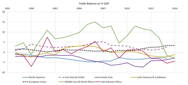
Some politicians are claiming that the labor market and trade balance has shifted globally. Indeed the trade balance of East Asia is positive at around 2.5%  of GDP in contrast with North America’s at -3.8% of GDP. While the EU is keeping a positive balance through the period that has increased in the current recovery. But this trade balances have been around these numbers for over two decades, so it is not a recent imbalance.

It is worth noting in the chart below the sharp drop in the trade balance that the Middle East is experiencing since 2013. From this drop we can see how their oil driven imbalanced economy is at risk from price fluctuations.

Траде баланце

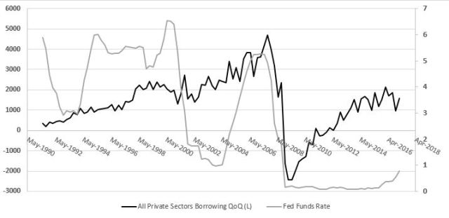
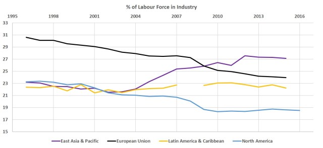
Further, if we look at labor data below, we can see that before the 2008 recession there was a trend of shifting industry jobs from North America and EU to East Asia. However, industry jobs in East Asia started to rise after the 2001 recession. This trend accelerated sharply during the Great Recession years, in one part due to companies trying to lower input costs and also further opening of the Chinese economy.

Industry jobs

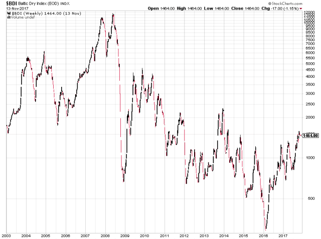
Also, the international shipping costs, as measured by the Baltic Dry Index below, after 2008 sharply dropped and have been on a downward trend ever since. This we can argue further motivated companies to produce wherever the labor was cheap and to ship goods globally.

BDI

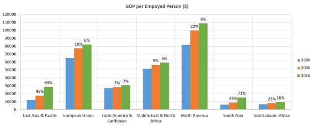
These shifts led to outperforming growth in productivity. East Asia saw 45% and 63% increase in GDP per employed person in the past two decades respectively. This compared to the EU’s 18% and 6% looks astonishing. North America however didn’t do bad, with the third best growth for the period – 22% and 9%. We need to keep in mind that these percentage growth rates are on a different basis and 22% on $81k is over $17k of GDP per employee for North America, while 45% on $12k  is just over $5k in East Asia. So we can say that the developing world has a lot of catching up to do.

GDP per emp

The greater factor contributing to East Asia & Pacific region being able to surpass the EU and North America in total GDP is clearly the bigger labor force. This labor force, however is not very skillful and is employed in manual manufacturing. It is worth noting that the developed world is burdened with higher levels of public debt, which is limiting governments’ options to boost growth to reforms, rather than spending.  Take the EU, which in the past several years experienced numerous debt crises leading to no growth of the regions’ economy. One can easily draw parallels with hyper indebted Japan and their lost decade.

Total GDP

We need not to give such credit to these manufacturing jobs in Asia as politicians are, as if you look at the technology available today it is just a matter of time that labor in the developing regions become expensive enough to be replaced by automated/robotic labor. From this statement we can argue that North America is probably better positioned for the years ahead, as not only the economy is more service driven which requires higher skill sets, but also they posses the best technology in the world.

However, there is more to be done in developed America in adjusting the education system to the requirements of new industries. In Internet usage we can see below that the EU and North America have great advantage over other parts of the world with 80% of the population using the Internet in these regions.

Internet Users

This is definitely another factor that gave rise to globalization and is probably a major contributor for this global shift in industrial jobs. As it made it easier for international trade to be conducted and for businesses to operate in multiple locations. Further, this as part of other technologies is probably one of the greatest advantages of the western world. So looking into these jobs shifted to Asia, that many claim will never go back to America there is also a positive side. This will hopefully prompt politicians to look ahead and beyond and work towards giving their workers a competitive edge for the service industries that are yet to emerge. These industries will most likely be oriented around computer science, AI and robotics.

Unfortunately for now populism is winning in US and UK where politicians instead of trying to look beyond hate and division are missing an opportunity to unite, modernize and push positive changes ahead. There are a few beacons of positivism had emerged in the face of Canadian prime minister Justin Trudeau and French president Emmanuel Macron, who seems to have support for major needed reforms.

Sector Rotation

Recently many talk about the economic cycle and the advanced stage that the current recovery/expansion is at. Even though each contraction/recession is caused by excesses in different areas of the economy, as the last one was credit in household mortgage lending and the one before that was in the technology sector, there are traditionally common features to every expansion and contraction.

During the boom years of the cycle, stocks of companies in sectors like Materials, Energy and Consumer Discretionary will outperform as the demand for their products is rising and at the very peak of the expansion the prices of these products are high. While in the contraction phase sectors like Utilities, Health Care and Consumer Staples will outperform due to the very basic, necessary character of their products. And this makes perfect sense, as if imagine your work hours are cut or you lose your job, you will still continue to pay your electric bills and still buy groceries, but you will postpone buying a new car or a new fridge and you might reduce the number of times you eat out.

In order to get an idea of how the current cycle has evolved we can analyse the returns of the major S&P 500 sectors as compared to the entire index. On the below chart we can observe the number of months that each sector performed better than the S&P 500 in a year starting October to September between 2007 and 2017. From this simple count of the months we can observe that some sectors are quite consistent in doing better then the market for the past 10 years.

Monts of outperformance

While IT, Health Care and Material outperformed on average 8 months in a year, Financials, Energy and Consumer Staples did better only 4.5 months on average. 2013 seems very intriguing as IT and Health Care couldn’t outperform in a single month, also 2017 doesn’t appear very good for health care again. But if we want to get more insight of the economic cycle and another reading of the current state of the economy we need to look deeper into the magnitude of these relative performances.

Looking at the average per cent. excess return relative to the market tells a whole different story. The second chart shows that we can do better if we are flexible rather then simply to overweight IT, Health Care and Materials as the previous graph would suggest. Here we can see more clearly the economic cycle in play with materials and energy doing well in 2011 and 2012 and Financials outperforming significantly in 2013.

While in the past year Health Care did extremely poor, underperforming in every month with almost 20% on average we can see that was not the case in 2008 and 2009. Back then this was the strongest performer in the index with average excess of 22% for both years, this is not so surprising as the bear market ended around mid 2009. During that period it seems like everyone was selling Financials, Dictionaries and Materials and was buying Health Care, Staples and Utilities. Keep in mind that the later three are traditionally considered defensive sectors. But health care seems to have done particularly well in general, it has the best average monthly excess performances at 4.4% for the past 10 years, which compared with the second best – Materials at 1.6% this is quite a good track record.

Sectors Monthly excess returns

An interesting relation that shows us that each cycle is unique is the fall in energy prices in 2015. We can see the sharp contrast between the returns of Energy and Material stocks and those of Utilities. What we can speculate here is that the utility providers saw a drop in their input costs which would lead to higher profits and in regards to utility bills we have to acknowledge that in general the consumer rarely sees reduction in their bills.

From the recent downturn in Health Care we can assume that investors are becoming less risk averse which is typical for the peak of a bull market. This suggest that it might not be a bad idea to start switching our attention to Health Care in the coming months or year. However, keep in mind that we should always take a holistic view of the stock market as part of the international economy and consider other factors as the Federal Reserve Funds Rate, GDP growth rate, global trade.

The Fed Balance Sheet And The Dollar

About two weeks before the Federal Reserve announced that it will start shrinking its balance sheet we started to see dollar strength, as you can see from the EURUSD chart below. A 2% decline was triggered by the announcement on 20 September, however if we are following closely the markets, as we should be doing, we can observe signals for this decline several weeks before it happened.

EURUSD6M_p

As the Fed announced its plans for selling US government treasury and agency securities in order to reduce its balance sheet the market orderly followed and adjusted the rate of the benchmark 10-year bond. The rate rose by over 8.5% in a matter of 2 weeks prior to the announcement and further 4.7% after.

US10Yr_p

Indication of future dollar strength was observed in The London Interbank Offered Rate or LIBOR market. Since London accounts for over 40% of world currency trade volume the benchmark rate appears to be a very accurate barometer for currency swings. US Dollar 3-month LIBOR rose 2.8% since early September, which compared to the Euro rate is a significant rise.

Libor3_p

What is fascinating is that the balance sheet reduction hasn’t even started and we are seeing this dollar strength which if leveraged only 5 times would yield a hefty 10% in the matter of two weeks. We cannot be absolutely certain that the dollar will continue to rise, but there appears to be some very serious market sings that this will be the case.

In addition it would be interesting to factor in the devastation from this year’s hurricanes and how they would impact the economy. Most suggestions are for boost to the economy and we should know that a strong economy is an underpinning factor for strong currency.

Short-Term Credit Cycle

Short-term credit cycles usually happen by prolong borrowings and building of debt, which are then followed by deleveraging; typically they last around 10 years. These cycles are defined by the booms, recessions and recoveries that economies go through. You can see these cycles in the chart below from 1947 till present very well depicted in the rise of unemployment during recessions.
UnEmpFred
In our regular watch over the US economy it is very important to look at what and why one of the most important participants/regulators in US is doing – The Federal Reserve Bank. The “Fed” is typically trying to control short-term credit cycles in order to help the economy get through recessions easier and less painful. They are doing that normally by two ways – controlling short term (overnight) borrowing cost and open market operations. When the Federal Reserve notices excessive borrowing and debt creation it will raise the short term rates which will translate down the system.

In the past three recessions, as we can see below, the short term interest rate – Federal Funds Rate, was elevated quite substantially to over 5 per cent.

All private borrowing

Two major trends we find very interesting from this observation. First is how the interest rate moves with borrowing. This is most visible between the past two recessions – The Dot Com Boom and The Great Recession, where private sector borrowing continued rising over 2 trillion per quarter up until the last recession. Second we can see that with every next recessions the interest rate was lowered to a new low – from 3 per cent. in 1992 to 1 in 2001 and to almost 0 in 2007.

The second trend is more related to the long-term credit cycle, which is a theme for another discussion. Here we will focus more on the rise of interest rates and we will look in some details of the recent borrowing trends. In the chart below you can see the private sector borrowing striped into its two major components – household borrowing and non-financial business borrowing. We can clearly see that the 2001 recession had bigger impact on corporate borrowing than on household borrowing, as the later continued rising until the Financial Crisis. Corporate borrowing fell to zero in 2003 only to sharply rise and surpass that of households by 2007.

Business vs Houslholds

After the latest recession we can see that household borrowing has returned to 2001 levels, however corporate borrowing has passed over that level and reached to 2007 levels. It seems that the rate rises from the past year is having some effect on corporate borrowing, but it was only short term and maybe the Fed will continue raising rates. Also, after comparing below the financial sector borrowing with that of non-financial it is very visible due mostly to regulation, that the financial sector borrowing is stable at around 500 billion per quarter.

Fin vs NonFin

All in all we can say that the current credit cycle is maturing and that this time excessive debt is building in the corporate sector of US. We will continue to observe Federal Reserve rate rise in the near future, however it seems that during the next recession we might observe a lot of corporate defaults, which could suppress stock prices. This will present many buying opportunities, but in the mean time we can utilize some derivatives strategies as we expect severe downturns in the stock market.

Is the Dollar up for a rebound or treasuries will fall?

This very first post to my new research site, on which I want to share with you my observations on the current situation of financial markets, would be about the US Dollar and the US 10 Year Treasury Bond Yield. These two assets considered the safe heavens in their classes, have been having  very fluctuating relationship dependent on global market conditions.

2YR Returns

Traditionally when investors feel the heat they run for longer term US treasuries, pushing yields down and run away from riskier assets (i.e. equities) which forces a dollar sell off. Remember that bond interest rates and bond prices have a reverse relationship, when bond yield is rising this means that price of the bond is falling, and vice versa. After the euphoria and optimism around Donald Trump election we saw the reverse – a run for riskier assets in the face of equities, which brought international money into the US pushing the dollar higher. On the other side these flows had to come from somewhere and we saw a sell off in bonds which pushed interest rates higher. This is reflected in the higher 13-week average correlation at the end of 2016.

4W Corr
Looking at the past ten years bellow we can see that the relationship represented by the 12-month average correlation peaked in the highs of the last recession.  However, we can observe that global turmoils also affect this relationship – during the European Debt crisis there was also, much smaller in proportions a run for treasuries. The difference in this instance is that investors also didn’t trust the Euro as a currency and piled in to the USD, hence the reason for the extremely negative correlation.

12M Correlation

Overall, we can say that in the past few months we have been seeing a dollar weakness which is mostly reflected in euro strength. This is mostly due to the positive sentiment on the European economy. However, EU stocks started to sell off in the last two months, which could have two reasons behind it – first the strengthening of the Euro which makes EU stocks more expensive; and global economic risks rising which will include peak in the short term credit cycle.

USD&Stoxx

For now we see US stocks still holding the record highs, but bond yields starting to fall already, keeping the correlation up. Next months look like a good time to start shifting from more volatile and riskier industries to more defensive ones. Also, would be a good idea to increase the overall proportion of bonds in the portfolio, as yields might continue falling and a sell off in stocks is more likely.

sc