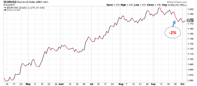
Recently many talk about the economic cycle and the advanced stage that the current recovery/expansion is at. Even though each contraction/recession is caused by excesses in different areas of the economy, as the last one was credit in household mortgage lending and the one before that was in the technology sector, there are traditionally common features to every expansion and contraction.
During the boom years of the cycle, stocks of companies in sectors like Materials, Energy and Consumer Discretionary will outperform as the demand for their products is rising and at the very peak of the expansion the prices of these products are high. While in the contraction phase sectors like Utilities, Health Care and Consumer Staples will outperform due to the very basic, necessary character of their products. And this makes perfect sense, as if imagine your work hours are cut or you lose your job, you will still continue to pay your electric bills and still buy groceries, but you will postpone buying a new car or a new fridge and you might reduce the number of times you eat out.
In order to get an idea of how the current cycle has evolved we can analyse the returns of the major S&P 500 sectors as compared to the entire index. On the below chart we can observe the number of months that each sector performed better than the S&P 500 in a year starting October to September between 2007 and 2017. From this simple count of the months we can observe that some sectors are quite consistent in doing better then the market for the past 10 years.
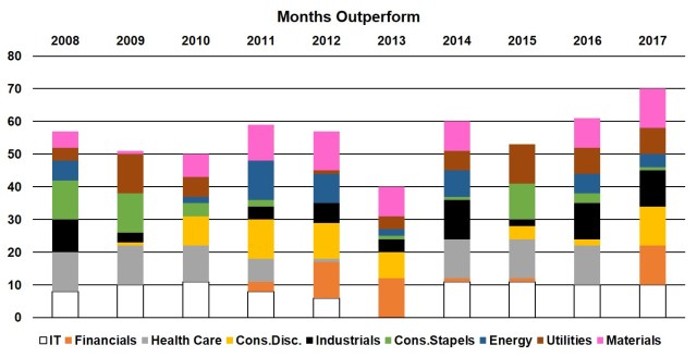
While IT, Health Care and Material outperformed on average 8 months in a year, Financials, Energy and Consumer Staples did better only 4.5 months on average. 2013 seems very intriguing as IT and Health Care couldn’t outperform in a single month, also 2017 doesn’t appear very good for health care again. But if we want to get more insight of the economic cycle and another reading of the current state of the economy we need to look deeper into the magnitude of these relative performances.
Looking at the average per cent. excess return relative to the market tells a whole different story. The second chart shows that we can do better if we are flexible rather then simply to overweight IT, Health Care and Materials as the previous graph would suggest. Here we can see more clearly the economic cycle in play with materials and energy doing well in 2011 and 2012 and Financials outperforming significantly in 2013.
While in the past year Health Care did extremely poor, underperforming in every month with almost 20% on average we can see that was not the case in 2008 and 2009. Back then this was the strongest performer in the index with average excess of 22% for both years, this is not so surprising as the bear market ended around mid 2009. During that period it seems like everyone was selling Financials, Dictionaries and Materials and was buying Health Care, Staples and Utilities. Keep in mind that the later three are traditionally considered defensive sectors. But health care seems to have done particularly well in general, it has the best average monthly excess performances at 4.4% for the past 10 years, which compared with the second best – Materials at 1.6% this is quite a good track record.
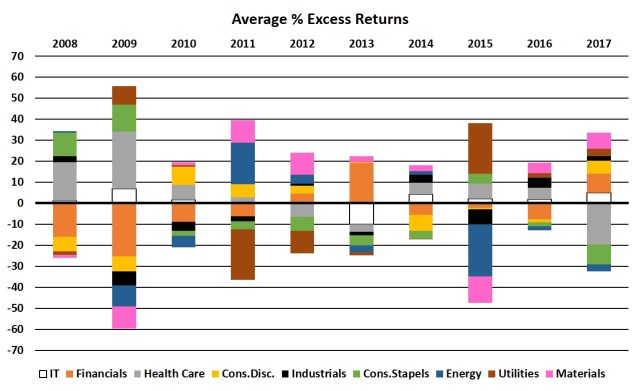
An interesting relation that shows us that each cycle is unique is the fall in energy prices in 2015. We can see the sharp contrast between the returns of Energy and Material stocks and those of Utilities. What we can speculate here is that the utility providers saw a drop in their input costs which would lead to higher profits and in regards to utility bills we have to acknowledge that in general the consumer rarely sees reduction in their bills.
From the recent downturn in Health Care we can assume that investors are becoming less risk averse which is typical for the peak of a bull market. This suggest that it might not be a bad idea to start switching our attention to Health Care in the coming months or year. However, keep in mind that we should always take a holistic view of the stock market as part of the international economy and consider other factors as the Federal Reserve Funds Rate, GDP growth rate, global trade.